- By: Josie
- Category: Help & Advice
- 0 comment
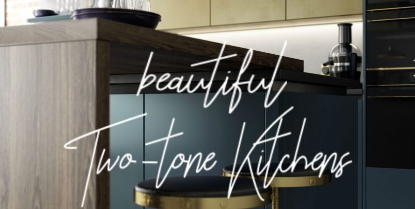
As kitchen designers, we’re at the forefront of the big trends in kitchen design – clients regularly come to us with ideas they’ve put together or picked up from sites like Pinterest and we help them take those ideas and turn it into something functional, beautiful, and fashionable that suits their needs. Recently, I’ve seen a big increase in the number of clients looking for two-tone kitchens, and so I’ve put together this design guide to help you narrow down the vast array of colours available into two that compliment each other, work within the space, and are unique to you.
As with all things, there are colours that come in and out of fashion, and others that are always a classic choice. When considering the colour combination you want to go for, consider first whether this is a choice you want to last, or whether you want to be able to update your kitchen as trends change. Bold colours, such as oranges, reds, pinks, greens, and blues have a tendency to go in and out of fashion so you’ve got to be willing to go through changing the doors/repainting them again, or commit to the colour because it’s one you love rather than because it’s a fashionable shade.
A good example of this is the shade ‘millennial pink’ – in 2016 through to the end of 2017, millennial pink was EVERYWHERE and we couldn’t get enough of it. A millennial pink kitchen would have been stunning at the time, but trends have shifted towards paler pastels and metallic shades over bold pinks which can look a little ‘last season’. To outmanoeuvre the changing winds of interior fashion, repainting your cabinet doors is the easiest route to go down – depending on how big your kitchen is, it’s not too much of an undertaking that can be repeated a couple of years down the line when the colours need updating. This is also a great option if, like me, you are incredibly indecisive and know you’ll want to change the colour as soon as you see it finished!
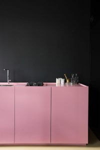
Pink kitchen cabinets (image from apartmenthterapy.com)
However, that’s not to say a bold colour can’t be a timeless and classic choice. While some shades of blue, eg. teal and pastel blues, are having a moment in the spotlight, one of our most popular colours at present is Marine – a deep navy blue that in a shaker door looks stately and farmhouse inspired, and in a slab door looks like the pinnacle of modern luxury.

A modern two-tone slab door handleless kitchen (image from poggenpohl.com)
Now we’ve covered the basic of choosing a general direction to go in with your two-tone kitchen, the most important thing to consider is which colour combinations you are most inspired by. If you’re seeking to convey a certain style of interior, there will be colours best associated with that style; for example, a farmhouse style interior will make use of pale colours in shades of off-white and cream combined with a contrasting pastel colour – perhaps a light grey or blue.
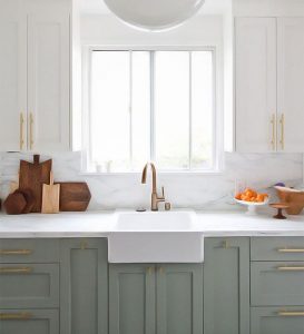
Two-tone farmhouse style kitchen (image from domino.com)
A modern interior, by comparison, may combine dark colours with sleek handleless doors; for example, a slab handleless door design with the cabinets that line the wall in a dark grey, and the island in a deep blue or green. An alternative way of combining these colours if you don’t have a kitchen island is with the grey on the wall cabinets and the contrasting colour on the base cabinets. If you choose to configure your colours in this way, always ensure the lighter shade is on the top and the darker shade is on the bottom.
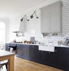
A navy and grey shaker style kitchen (image from houseandhome.com)
So, we’ve established which shades to go for, which colours to choose depending on your interior style, and how to configure the colours. Finally, the most important stage of all; picking your two tones! It’s important to remember that colours can be altered by screens, and what you see on a website may not be the exact same when you see the physical product. Collect samples, visit homeware and DIY shops to get an idea of the popular paint shades, combine shades you wouldn’t expect to work together (you might be pleasantly surprised!) and shades that are a classic pairing (no space to go wrong), and most crucially… look at your samples in the light of your kitchen! Colours vary HUGELY depending on the light they are viewed in, meaning the best place to work out your colour combinations is in the very spot they’re destined for.
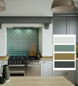
An example of a multiple tone colour scheme within the kitchen.
For a comprehensive selection of beautiful colour schemes, visit the Rigid Kitchens Online Pinterest (www.pinterest.co.uk/rigidkitchens) where there are boards covering everything from colour schemes to kitsch accessories for once your kitchen renovation is complete!
