- By: Josie
- Category: Help & Advice
- 0 comment
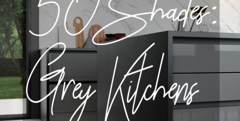
There’s been think-piece after think-piece written on the colour grey, an interior design staple that waxes and wanes through the years, sometimes peaking in popularity and sometimes fading into the periphery – but it’s still there. Whether it’s a warm grey wall with white skirting and shabby-chic decor in a suburban family home or a heavy, dark tone in an architect-designed property, grey endures through many an interior design trend. But why? An inherently unremarkable colour, the only colour to be made up of combined shades (white and black are opposite ends of the shade spectrum, and do not feature on the colour wheel), grey is seen by some as an oppressive choice, but by others as a liberating one.
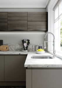
Our Aldana range in Graphite grey
As an independent kitchen retailer, we are at the forefront of client interior design preferences. We are among the first to see the trends that people love translate into real-world design choices, and as a result we’ve seen a real explosion in the popularity of grey kitchens. Whether it’s incorporated into a two-tone gloss design paired with an off white (or a bold orange!), or a matte shaker throughout, grey has been an exceptionally popular choice this season for a wide range of clients.
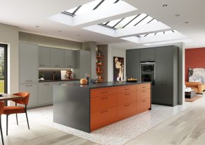
Our true handleless Zola range in Dust Grey and Bold Orange
Much like the widely despised magnolia did a few decades ago, grey has become ubiquitous as the base colour as choice. While all-white was a popular look a few years ago, white does not hold up to the wear and tear of daily life – marks show up easily on the walls, grease marks and fingerprints are a constant problem – meaning the trend died out in favour of more forgiving wall colourings and home decor. With so much variety available, grey was the obvious choice.
There are three key points to consider when styling your grey kitchen (although these principles could be applied to any room); shade, texture, and contrasting colour.
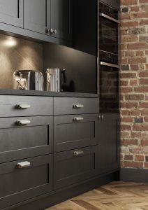
Shade: The shade of grey you use within the kitchen is crucial. Whether you are painting your walls or getting new cabinet doors, the shade you choose will be visible in large blocks across the room. Consider what is already in the space and the mood you want to achieve – would a light or dark grey work better? A cool grey (with blue tones) or a warm grey (with orange tones)? Warm, lighter greys are a great family home choice. Welcoming and cozy, with great depth of tone, they create an involving backdrop to family life (and are very forgiving for kids experimental wall art projects – crayon is easier to cover in grey than it is white!). Accessorise with thick colourful rugs, big statement cushions, bold block colours in shades of red or orange, and modern light fixtures. Cool, darker greys are a more dramatic choice, great for eye catching, statement interiors. Best utilised in light, spacious rooms, a dark grey can be a fantastic design choice when used effectively. Lean into the cool colour scheme with bold blue and green statement decor items, large monochromatic artworks hung on the walls, and minimalistic furniture in lighter greys and white shades.
Contrasting shades of grey create a modern and clean look.
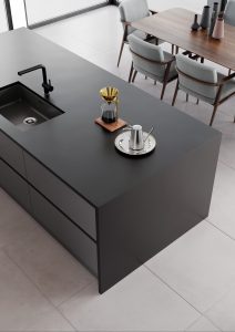
Texture: Sticking with our area of expertise, texture within the kitchen is a crucial consideration. Of course, large expanses of wall will be matte emulsion, but there is choice when it comes to cabinet doors – from gloss and matt vinyl to real painted wood and veneer, there are plenty of options when it comes to texture. A good rule of thumb is that your textures should alternate; a smooth, shiny tile floor paired with a matt cabinet door, in turn paired with a shiny stone worktop and matt wall paint. This principle can be reversed for matt floors, eg. wood floors; matte wooden flooring and gloss cabinet doors paired with a worktop that’s less reflective (eg. Corian or Tristone) and a tiled or glass backsplash. The texture of decor items should also be considered, and it’s a great way to get really creative with the items you decide to include and arrange in your kitchen.
Wooden textures contrast with the smooth grey base unit doors.
Contrasting colour: As mentioned earlier, the colours that work best with a shade of grey vary from shade to shade – it also depends on how flexible your definition of grey is! To limit the huge amount of variation available, we’ll stick to the popular shades that are seeing a resurgence at present. Middling shades of ‘true’ grey (only made up from white and black) are among our best selling door colours at present, with Dust Grey being a particular favourite of ours. Other popular shades are extremely light greys which are closer to an off-white, sometimes with cream hints like our popular shade Cashmere. On the other side of the spectrum, shades with names like Graphite (a brooding, dramatic tone), Lava (softer than black, but not by much), and Gun Metal Grey (just as aggressive in it’s stark, dark shade as the name makes it sound). If your more inclined towards the light shades, there’s much more room to contrast using darker and bolder colours – anything in a primary colour compliments these shades of grey well, as do most shades in-between. The key to avoiding colour overload is to define a palette you like and stick to it – use colours that are closely related or opposite each other in the colour wheel for maximum effect. On the other hand, a dark grey base colour welcomes light pastel shades in contrast, pastel pinks and blues being a versatile choice. It’s easy to overload on bright colours in a room with dark walls, but this is a common mistake. A dark colour is a bold choice in and of itself; it doesn’t need overwhelming decor to add to that! Lean into the dark side and embrace minimalist decor, moody artwork, and light touches of colour where they’re needed.
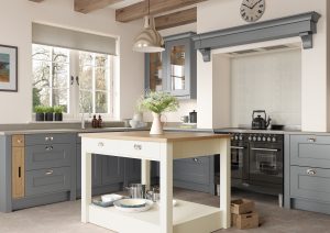
Not just for modern kitchens, grey works beautifully in the Modern Farmhouse style.
Armed with this comprehensive guide to grey in your kitchen, you’re ready to crack out the paint (or the new cabinet doors) and get redecorating. Don’t listen to those who tell you grey is a middle of the road choice – walking down the middle of a road is a terrifying and risky experience, much like a grey colour scheme (although the grey colour scheme is much more likely to have a positive pay off than any adventures in the middle of the road).
Looking to renovate your kitchen? Get in touch today on 01273 746510 or visit our website at www.rigidkitchensonline.com and find out how we can help you towards the bespoke kitchen of your dreams at a pleasantly surprising price!
